On the platform, you’ll see various gauges and icons that help you understand how your community compares to others. These appear on pages like the Indicator Detail Page and Curated Dashboards.
Color Coding
- Green = Good
- Red = Bad
- Blue = Neutral
Colorblind Mode
When users enable Colorblind Mode, the platform makes three changes:
- Thumbs are added to gauges to indicate positive (thumbs up) or negative (thumbs down) performance.
- Colors in data visualizations update to colorblind-friendly palettes for improved accessibility.
- The legend updates to match colorblind-friendly palettes.
Types of Gauges
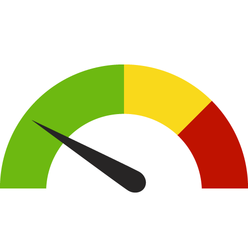
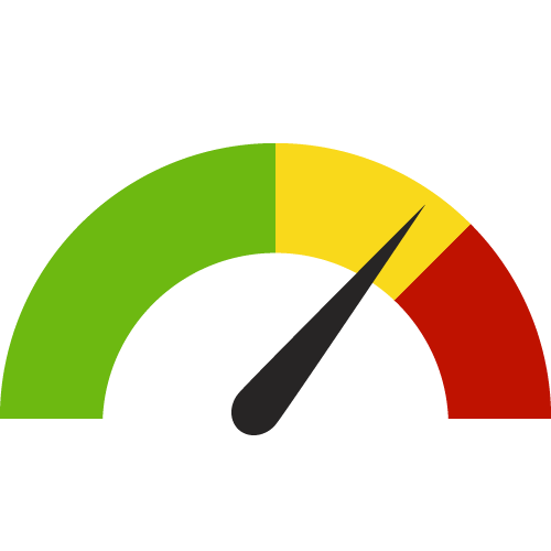
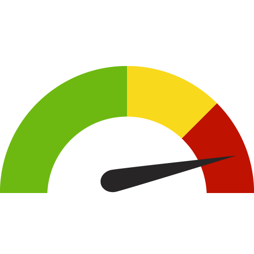
Compare to Distribution (Dial Gauge)
Shows how your community compares to others:
- Green = Best 50%
- Yellow = 50th to 25th percentile
- Red = Worst quartile
Compare to Target (Circle Gauge)
Compares your value to a target:
- Green circle with check = Met or better than target value
- Red circle with X = Did not meet target value


Compare to a Value (Diamond Gauge)
Compares to a single value:
- Arrow below line = Lower than comparison value
- Arrow above line = Higher than comparison value
- Equal sign = No difference in value


Compare to the Prior Value (Triangle Gauge)
- Triangle up = Value increased
- Triangle down = Value decreased
- Equal sign = No change
- Green = Positive change
- Red = Negative change


Trend over Time (Square Gauge)
Shows trend across multiple periods (up to 10):
- Solid color = Significant change
- Outline = Not significant
- Green = Positive trend
- Red = Negative trend
- Blue arrow = Neutral trend
- Equal sign = No change
To learn more about how we calculate the trend, please visit the Mann-Kendall Test for Trend Overview.


Other Icons
Calendar = Indicates the time period of data collection